Here are a couple of drawings I produced as part of my mini residency at the Southbank Centre's Vintage Festival last weekend. I am thrilled to have been part of such a fantastic event and feel it has provided me with almost too much inspiration to capture on a page! This, then is the start of a much bigger project that will develop my first findings. So, keep your eye out for more in the future!
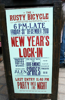
Having created a largely typographic piece, I found myself being drawn to the various vintage typefaces that peppered the festival in the stall holder's logos, the bric-a-brac stalls and the brilliant Southbank signage created by the amazing Morag Myerscough. Here are some of my snaps of the type I found and lovely people I met.
Showing posts with label Hand Drawn type. Show all posts
Wednesday, 3 August 2011
Monday, 4 July 2011
10 Days by Ripo
Typography and illustration so often runs the risk of appearing like impotent decoration. I for one am (proudly) guilty of producing work that's stylistically beautiful but perhaps lacking in concept or thought provoking message. The same cannot be said of this wicked video by Ripo. An incredibly talented typographic artist with refreshing ideas he's appears to buck the trend of ornamental typography. Yes, I'm late in discovering it but I need to share it just incase.
Labels:
Artist,
Graffitti,
Hand Drawn type,
Ripo,
Type,
Typography
Wednesday, 25 May 2011
Saturday, 16 April 2011
Mode of Transformation - Mowhawk Paper Promotion
In their efforts to show off the latest printing techniques and range of effects, promotional booklets produced by paper suppliers can run the risk of looking gimmicky. In this design by VSA Partners' for Mowhawk Papers the printing is modest and beautifully anonymous; the exquisite craftsmanship and thoughtful compositions are what promote the product.
I like the subtle analogy of the paper's history to the evolution of the bicycle and think the combination of digital and hand drawn typography softens the message. For these reasons it is up there as my favorite piece of editorial design of last year.
Subscribe to:
Posts (Atom)